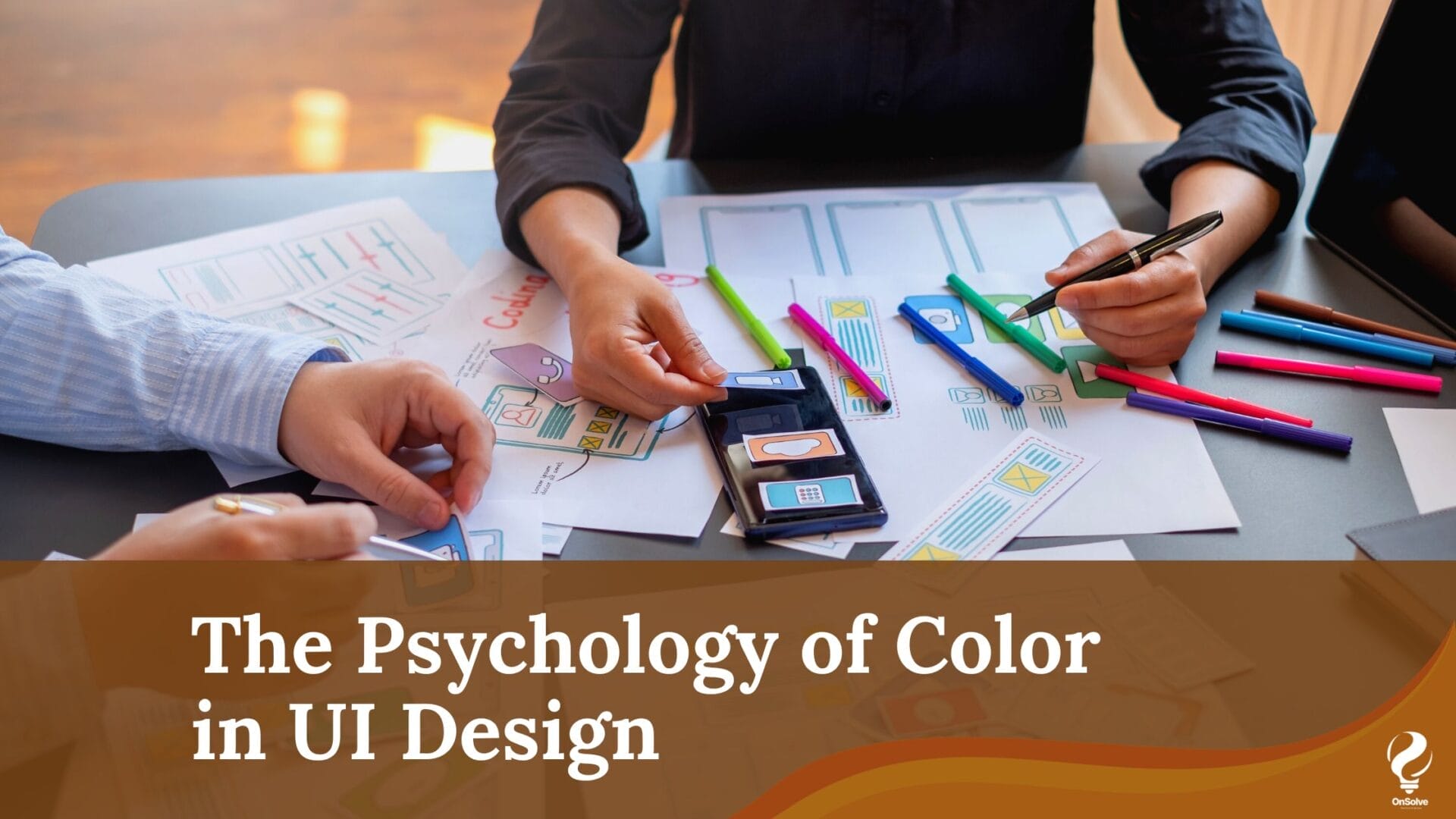
Introduction
In the realm of user interface (UI) design, color is a silent yet powerful tool. It plays a crucial role in shaping the user’s perception and experience when interacting with digital products and websites. The psychology of color in UI design goes beyond aesthetics; it taps into the human psyche to evoke emotions, convey messages, and influence user behavior. In this blog, we will delve into the fascinating world of color psychology and explore how it can be harnessed to create more compelling and effective UI designs.
Understanding Color Psychology
Color psychology is the study of how different colors can affect human emotions, behavior, and perception. Each color carries its own unique set of connotations, and these associations can vary based on cultural, personal, and contextual factors. As UI designers, it’s crucial to harness this knowledge to create designs that resonate with your target audience.
Primary Colors and Their Meanings
Red:
Red is a high-energy color associated with passion, excitement, and urgency. It can be used to draw attention, such as for call-to-action buttons.
It can also symbolize danger or caution, making it a suitable choice for error messages or warning signs.
Blue:
Blue is often linked to trust, security, and professionalism. It’s a popular choice for corporate websites and social media platforms.
Lighter shades of blue can evoke a sense of calm and relaxation, making them suitable for healthcare or meditation apps.
Yellow:
Yellow is a cheerful, optimistic color that can convey happiness and warmth. It’s commonly used for branding in industries related to food and children.
However, excessive use of yellow can be overwhelming, so it’s best employed in small doses.
Green:
Green represents nature, growth, and harmony. It’s ideal for eco-friendly or wellness-focused designs.
Darker greens can also imply wealth and prosperity, making them suitable for financial and investment platforms.
Secondary Colors and Their Meanings
Purple:
Purple is often associated with creativity, luxury, and spirituality. It can be used to create a sense of elegance and uniqueness.
Light purples may promote a sense of nostalgia or romance, while darker shades convey mystery.
Orange:
Orange is an energetic, playful color that can encourage action and enthusiasm. It’s often used for websites targeting a youthful audience.
Like red, orange can be used to highlight key elements and attract attention.
Pink:
Pink is associated with femininity, romance, and tenderness. It’s widely used in beauty and fashion industries.
Lighter pinks can evoke feelings of sweetness and innocence, while bolder pinks can symbolize confidence.
Utilizing Color in UI Design
Consistency:
Maintain a consistent color scheme throughout your UI design to create a unified and professional look.
Contrast:
Use color contrast effectively to guide users’ attention and ensure readability. Dark text on a light background or vice versa is a classic example.
Accessibility:
Ensure that your chosen colors are accessible to all users, including those with visual impairments. Use tools to check color contrast ratios.
Cultural Considerations:
Be aware of cultural differences in color symbolism, as the same color can have varying meanings in different parts of the world.
Conclusion
Color is a versatile tool that UI designers can use to create user experiences that resonate on a deep emotional level. By understanding the psychology of color, you can effectively communicate brand messages, guide user interactions, and enhance the overall user experience. The key is to strike a balance between aesthetics and functionality, ensuring that the chosen color palette aligns with the goals and emotions you want to evoke in your users.
Credits: Medium


